Pentagon – Branding and Logo Design
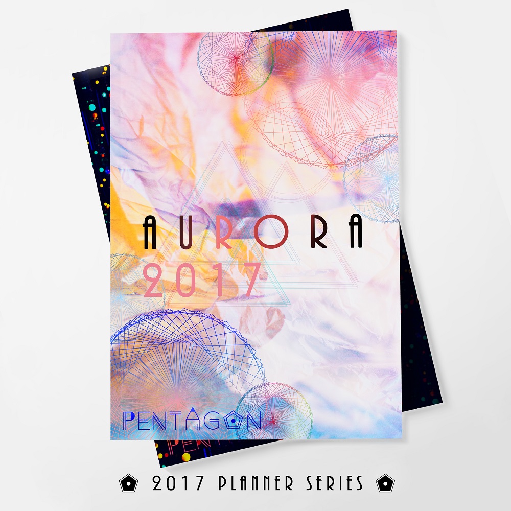
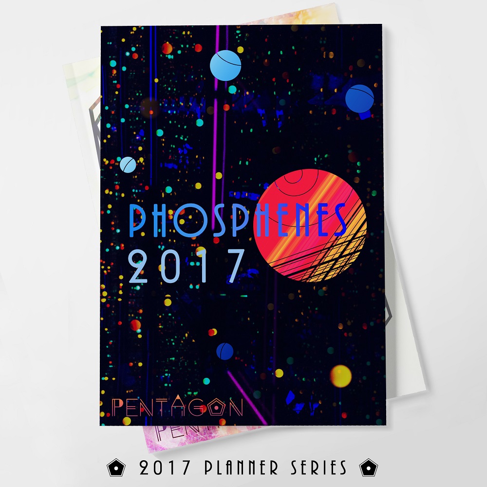
Pentagon is a stationery store brand originally designed for a contemporary, modern and cut-edge retail precinct. It is a brand which aims to offer young adults stationery designs that are elegant, classy, and yet acting as basic, affordable and essential items for them. Pentagon’s products also aim to reflect the sentiments of youths through abstract geometric art.
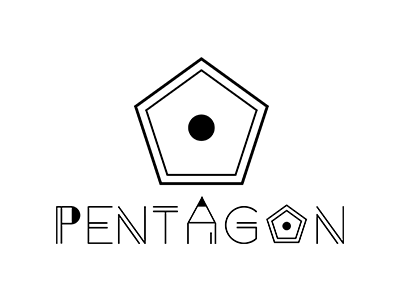
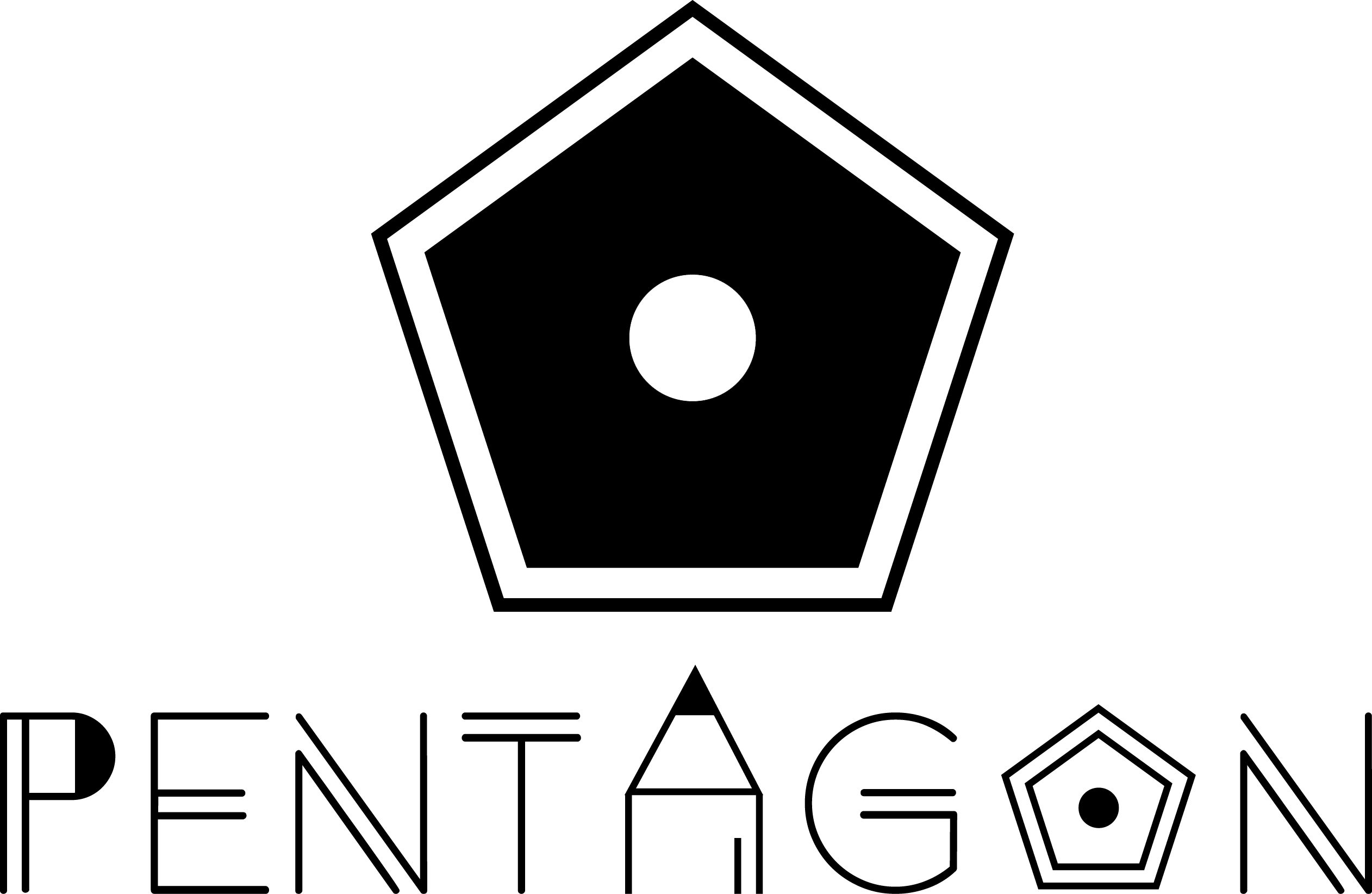
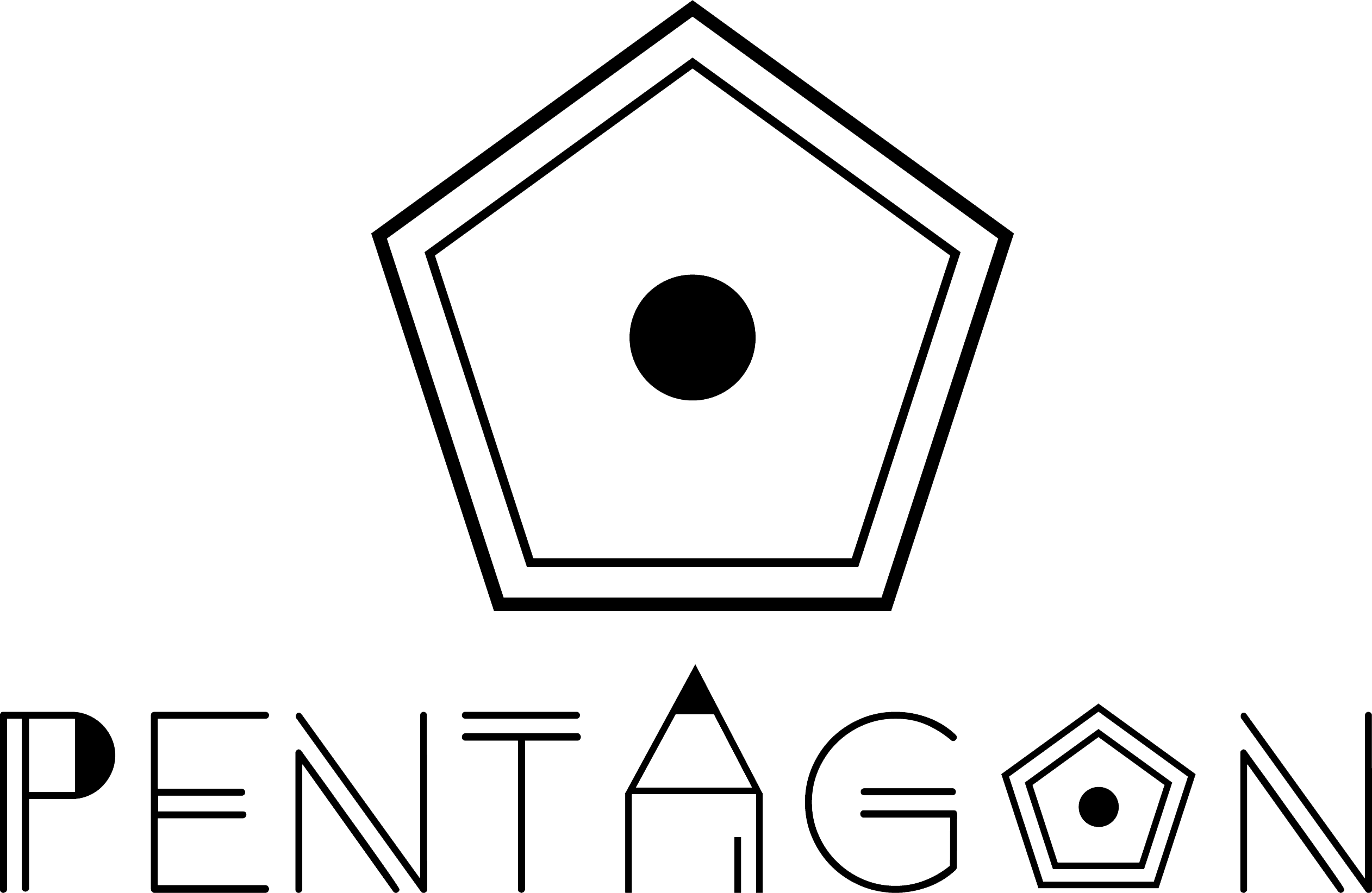
There are 3 key elements in my logo. The first one is the literally meaning of the word ‘Pentagon’ which has the word ‘pen’ in it. Pentagon is also a geometrical shape and geometrical shapes form an important part of minimalistic designs. The pentagon and circle shapes form the cross-section of a pencil. The triangle part of the typography represents letter ‘A’ and a pencil tip.
The target audience group consist primarily of young adults of 20-30
years old who are open to experimenting with sophisticated and complex colours due to their exposure to computer graphics.
Iconographic

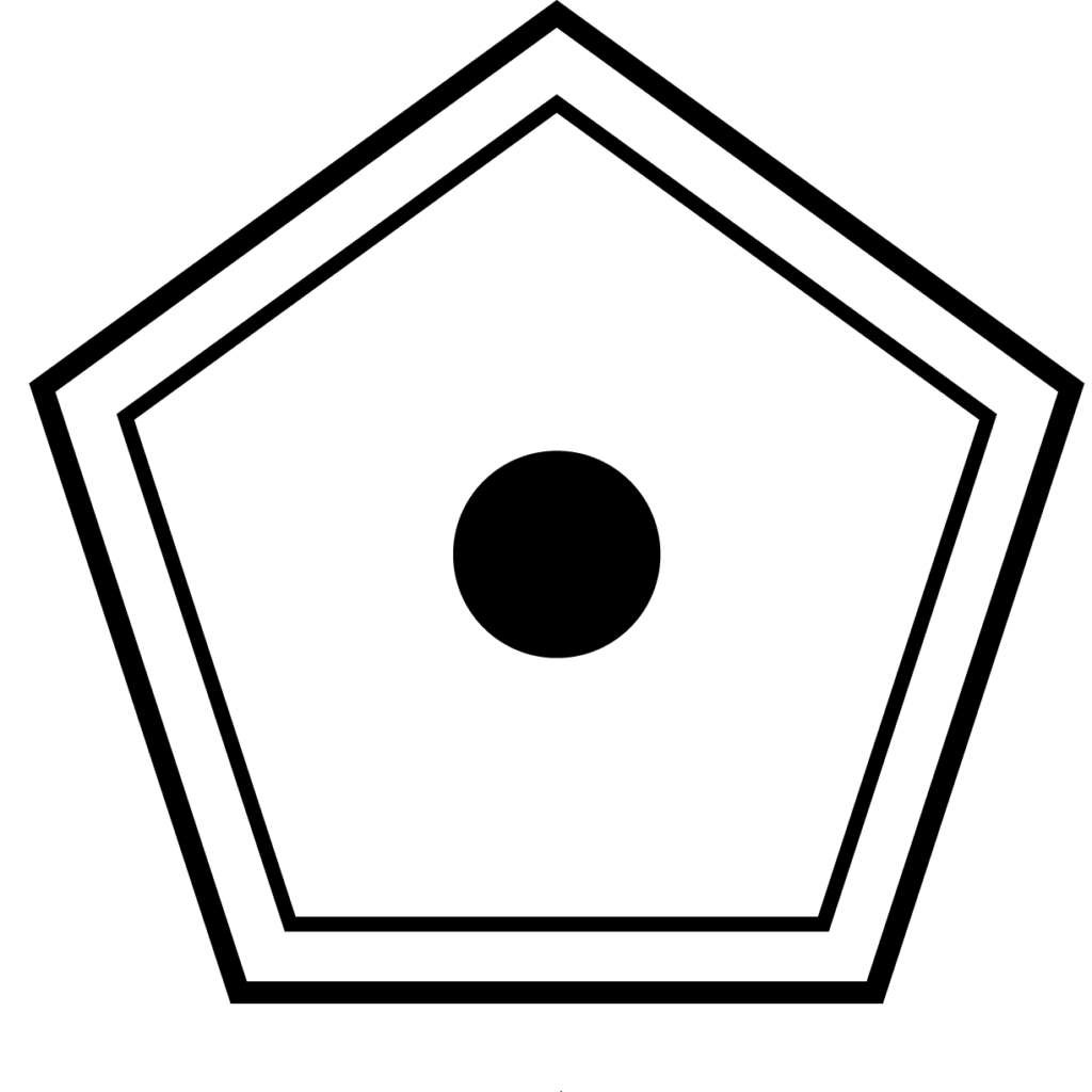
Typographic

Full Logo
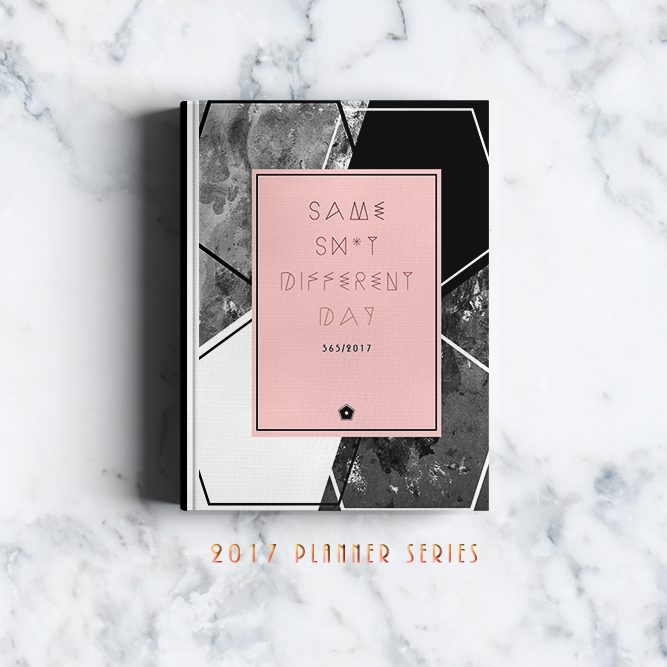
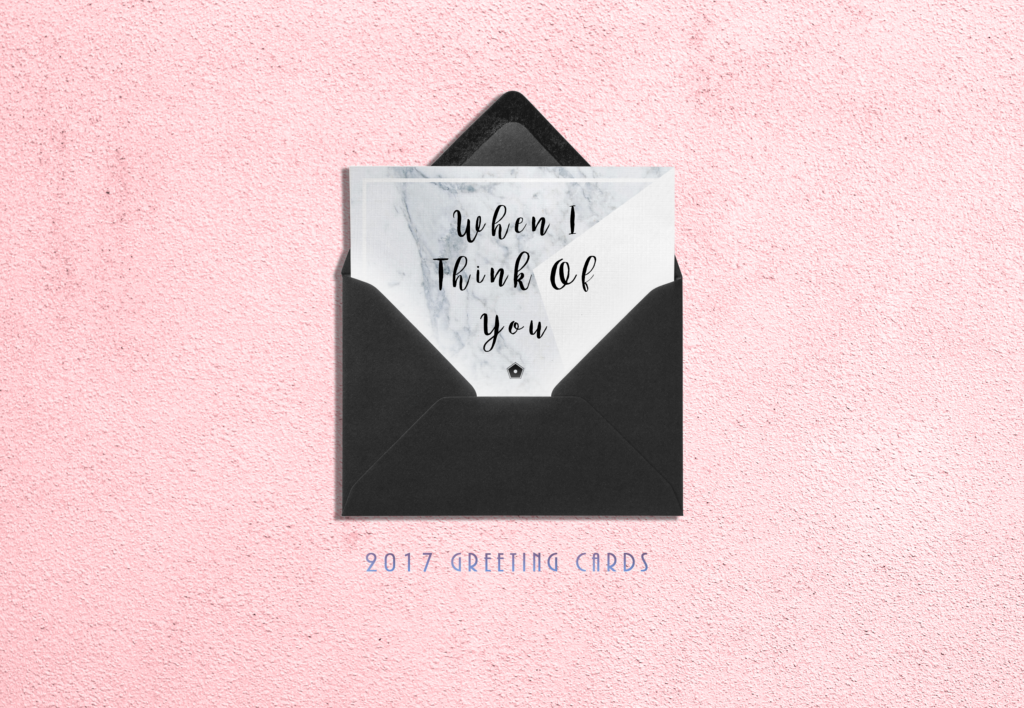
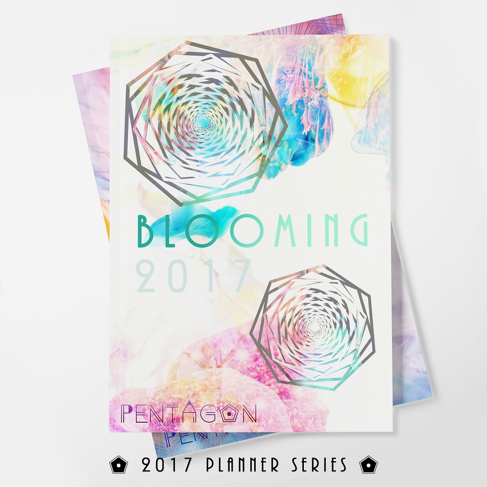
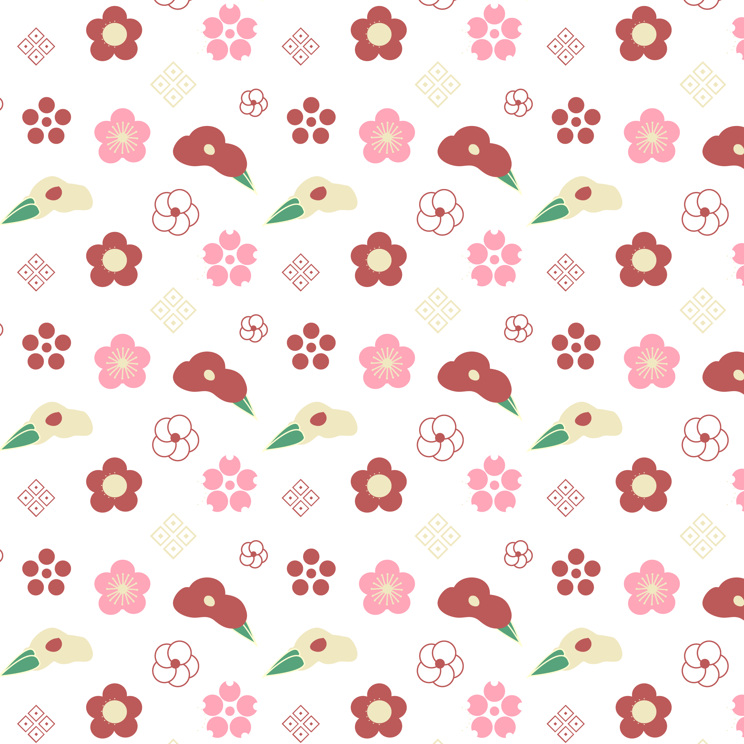
Product Mockups