Interface Design – APIA Funeral Insurance
About Project:
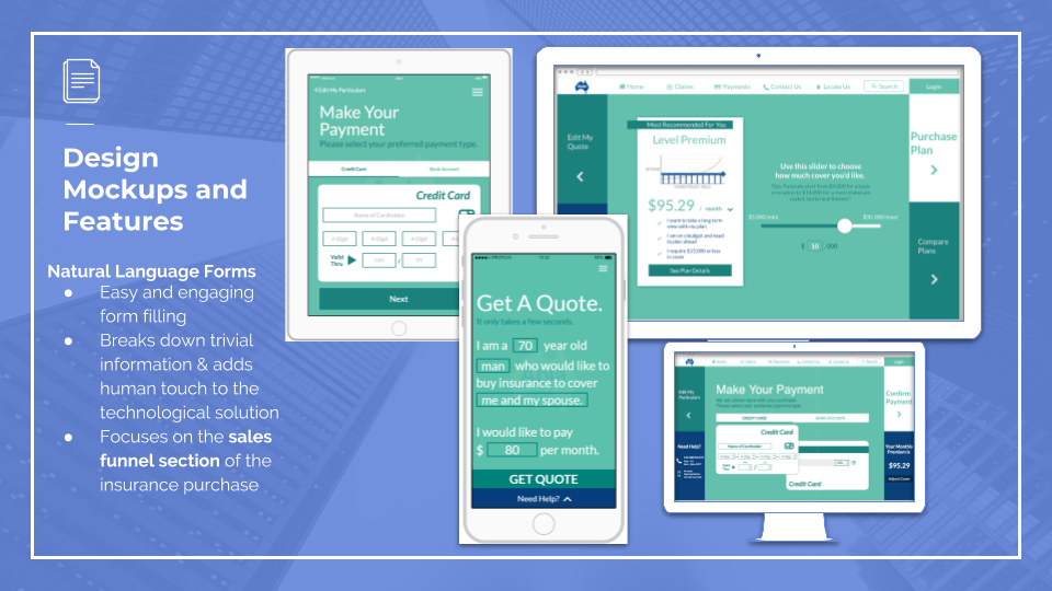
This interface design project focuses on re-designing Apia’s Funeral Insurance sales funnel to provide customers a better online sales experience through Natural Language Forms.
Apia is an insurance company whose target demographic group only includes 50+ year olds senior users. The project challenges me as an UI/UX designer to design an interface which allows customers to confidently research, interact and purchase the insurance in a simple and seamless experience.
Platforms: Native IOS App, Desktop, Tablet
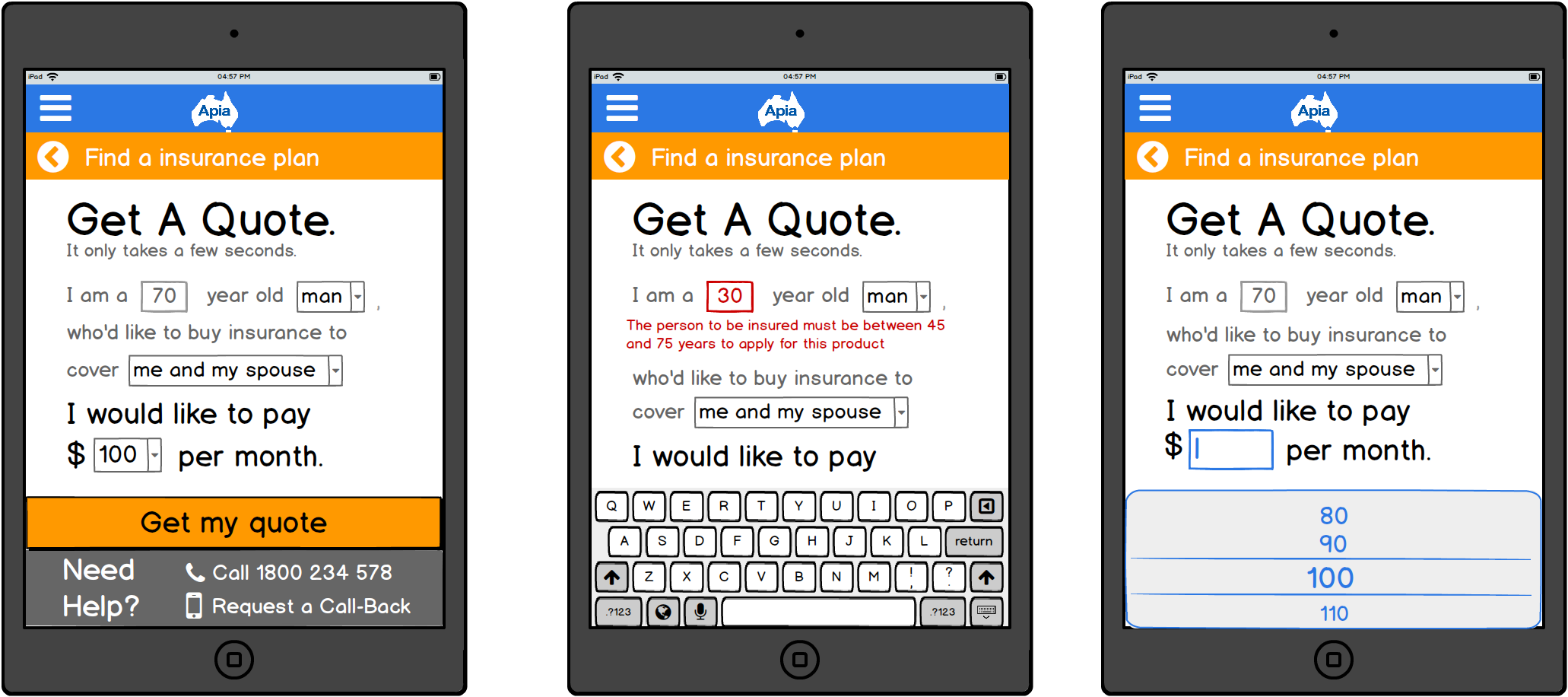
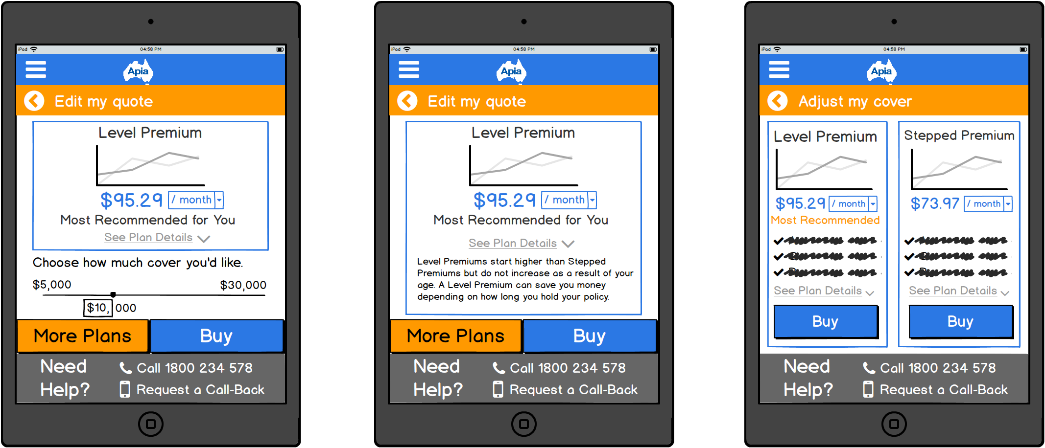
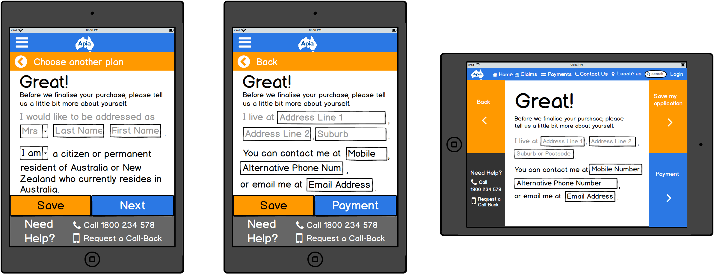
Prototype Demonstrations on Proto.io:
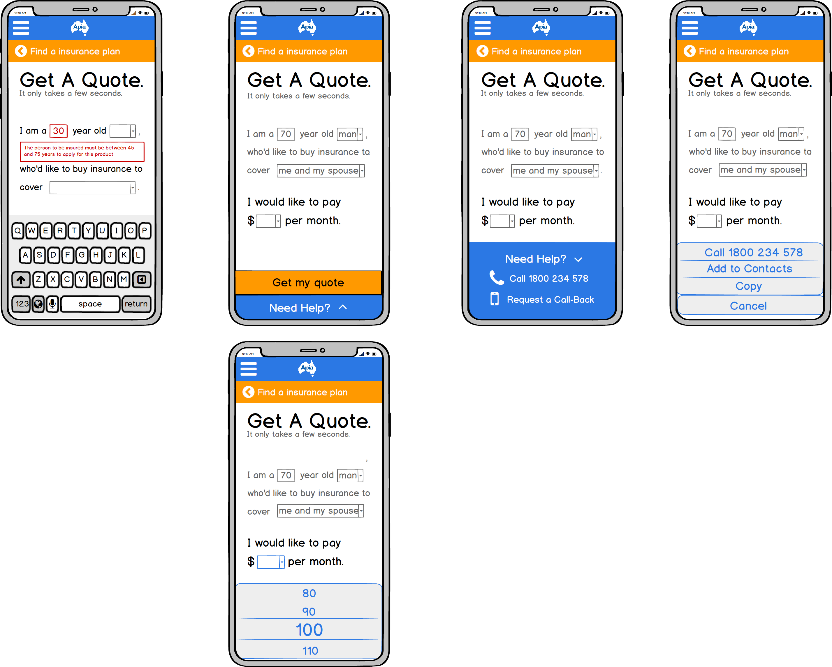
Native iOS app: https://pr.to/ALJ9M2/
Web-based solution for desktop: https://pr.to/P5K6QB/
Web-based solution for tablet: https://pr.to/PSDACU/
Video Walkthrough:
Role: Group Leader, UI/UX Designer
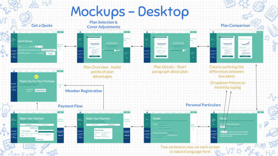
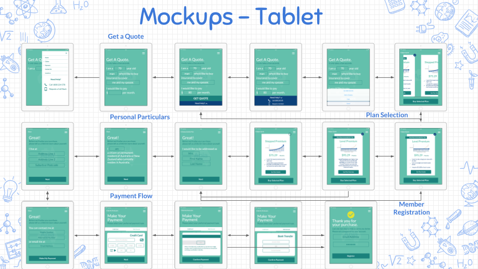
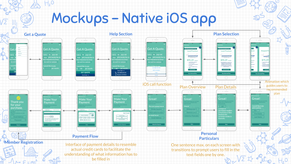
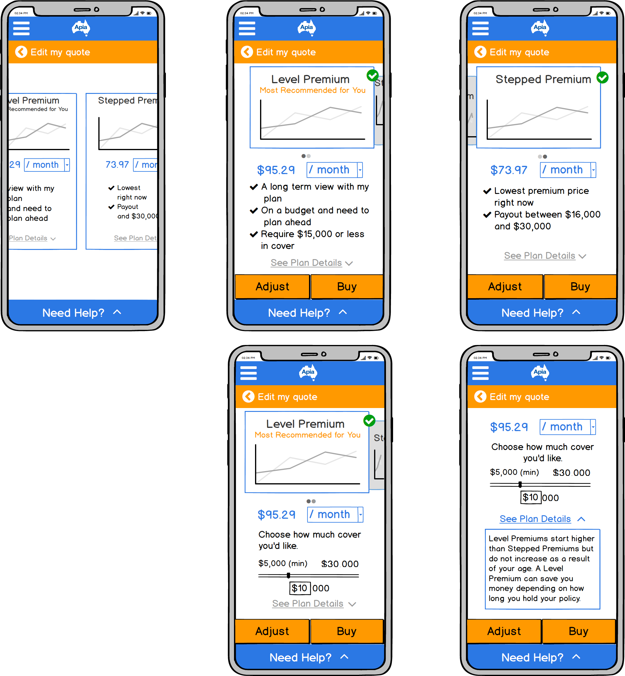
Design Mockups & Wireflows:
Background Research & Target Demographic Group:
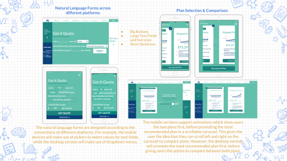
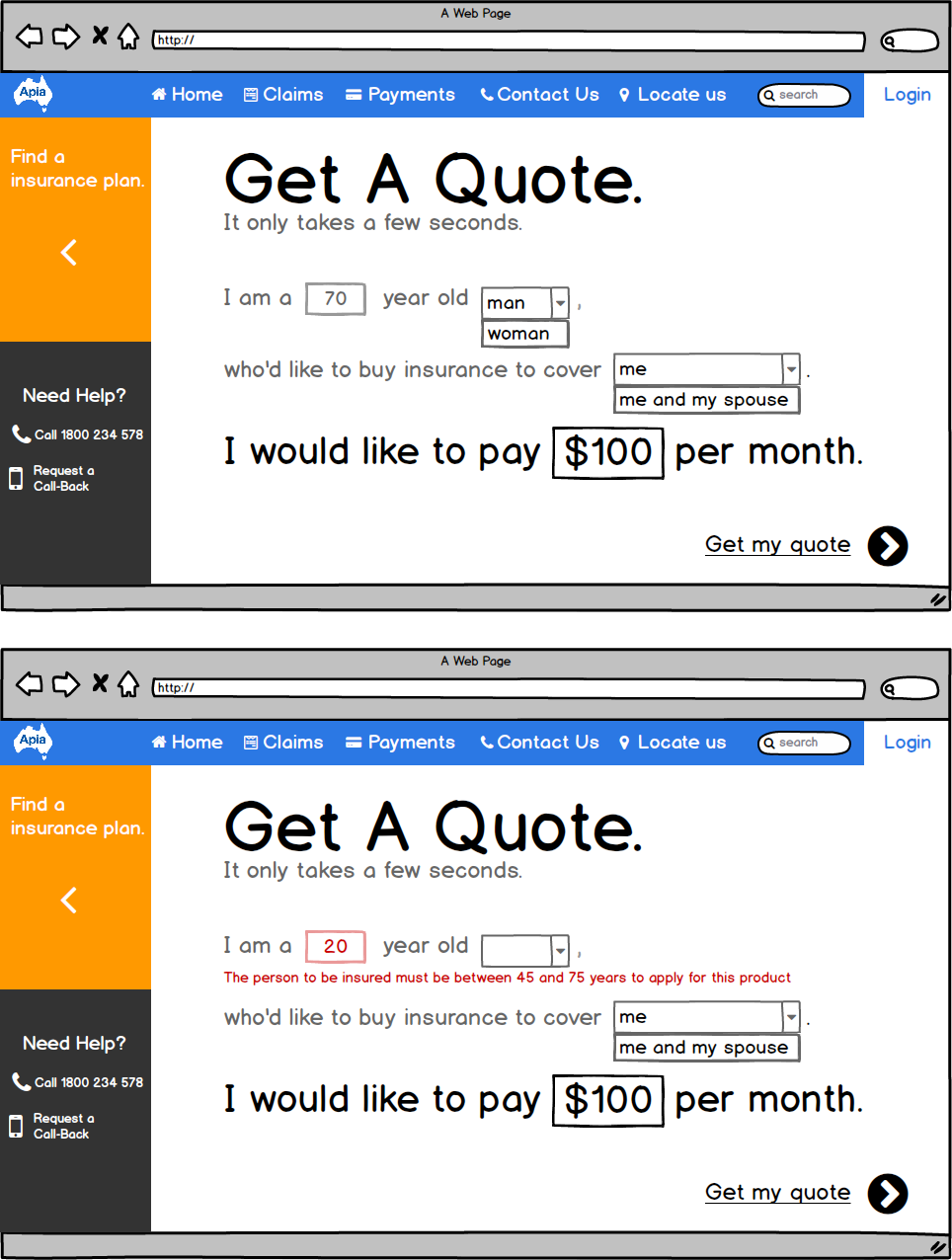
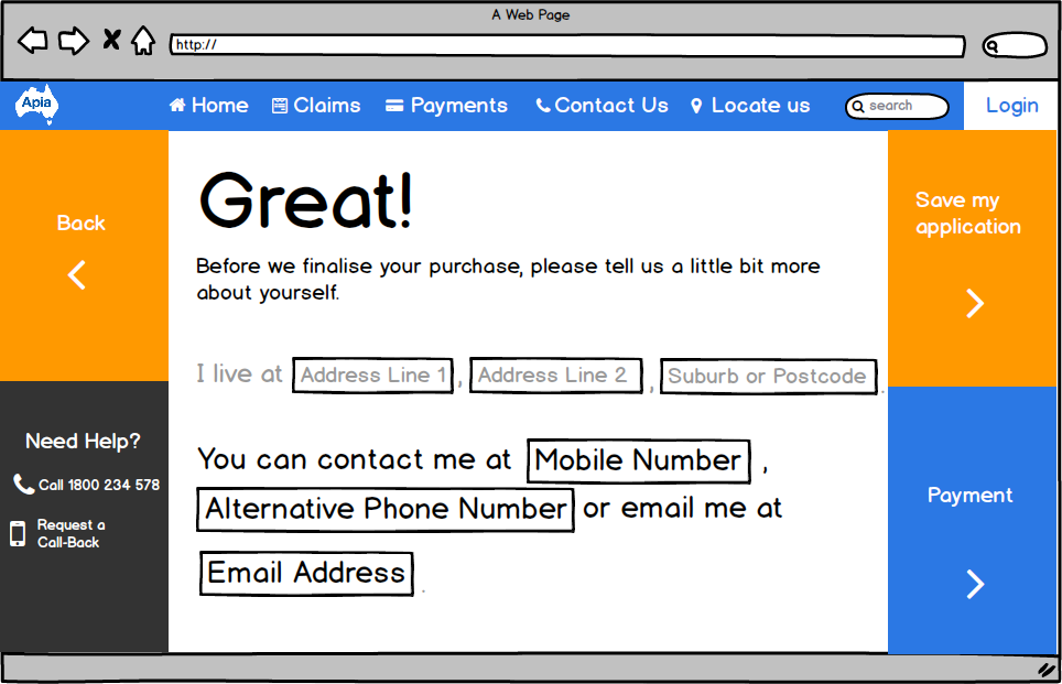
According to the team on vas.com (Röhm, 2014), using a natural language form can generate higher sales conversions on websites. It is a form which abandons the conventional label and input field style. Instead, the input fields are embedded within a short sentence, written in natural language. The user is requested for the same information but in an engaging, narrative form. These forms are only concerned more with the interface design and uses animations and transitions to engage users in a smooth form-filling experience.
As suggested by our user research, information overload is a common situation which many users face on web interfaces. Specifically, the target audience group of 50+ year old seniors typically experiences age-related impairments pertaining to vision, physical ability, hearing and cognitive ability which can affect their user experience and comfort level when they interact with computers or mobile devices. Research results from Nielsen Normal Group (2013) also suggest that elderly users over 65 years old are more likely to not complete tasks online as compared to users under 55.
Information overload is the most significant reason which causes them to be distracted or decrease their motivation to complete the sales funnel. Through our solution, we proposed a simplified form filling process through the use of natural language forms, with large text fields and buttons which can aid older users better in completing tasks online (Moth, 2013).
Design Process:
Our initial concept was to embed a conversational form in a chat bot function to support and assist the elderly users when they face difficulties in filling out the usual form in the sales funnel. This solution is concerned with natural language processing, which is related to artificial intelligence and how machines can process human natural language.
However, upon self reflection and feedbacks from professionals. we realised that this solution will require more resources and effort to develop than our current solution, which is only concerned with the interface and visual design of the forms in the sales funnel.
In addition, this initial solution made the assumption that all users will face difficulties when they fill out the form. However, not all of the users will face difficulties and will need to turn to the chat bot for help. Hence, the initial solution was not as effective as it seems.
From that, we moved on to our current solution by taking with us the core concept of the initial solution, which is to break down trivial information to facilitate a easy form filling process, and proposed the new solution in the form of a natural language forms.
Wireframes:
Through these wireframes, we proposed different UI elements and features and tested these features with our peers. Many changes to the features were made in this process before we progressed onto wireframing in Balsamiq. Changes were related to the functionality and effectiveness of the design. We stood by the principle of “Less is more” and prioritised the needs of our target demographic group first, instead of incorporating cool but unsuitable features.
Tablet:
Wireframes – iOS:
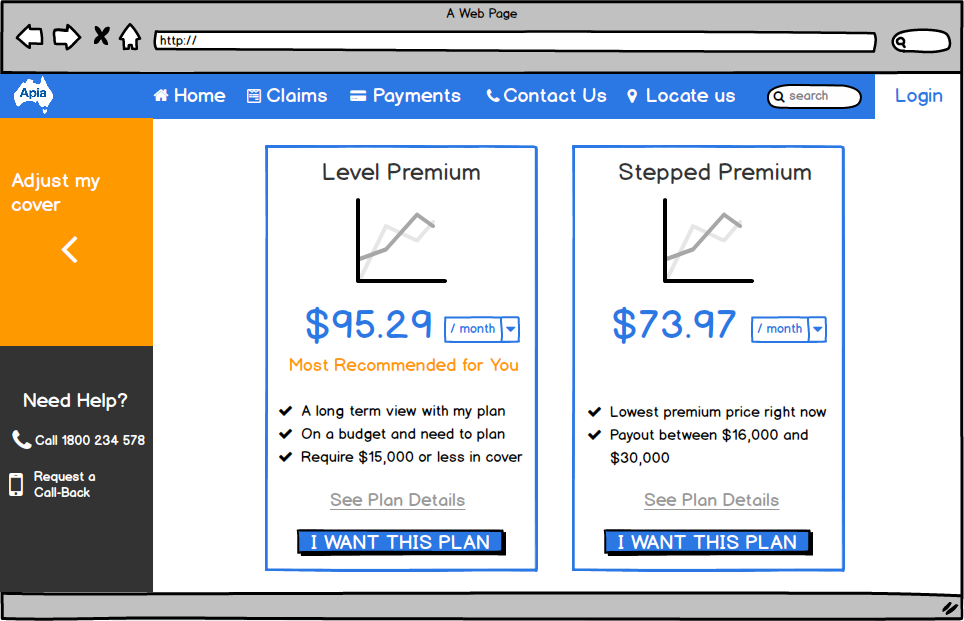
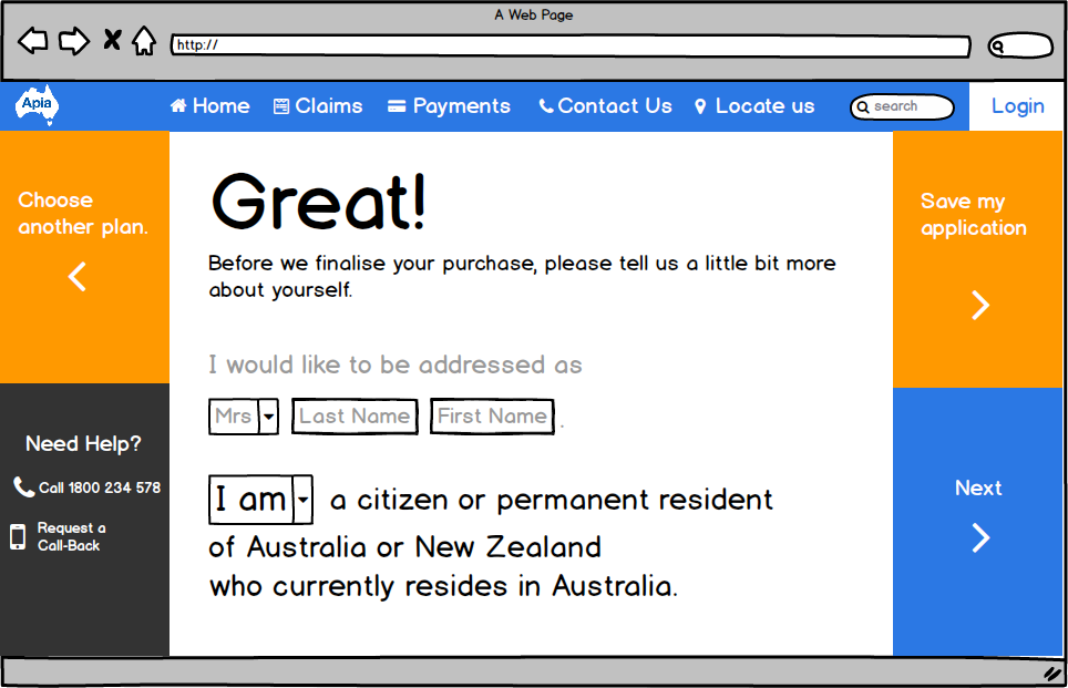
Wireframes – Desktop:

Limitations of project:
The limitations of the project include that we did not have a chance to test our interactive prototypes with the actual target demographic group. Testing with our target user group is essential to really understand their needs beyond literature review and research. Despite the fact that most of our testers are professionals in the design area, they might not be able to fully represent our users in terms of user habits. They are also more technologically literate, unlike the senior users.
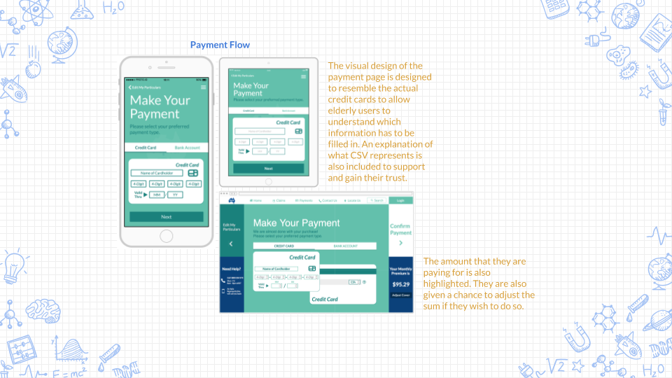
In addition, due to the limitations of our prototyping tool, and also the limitations of our skills, we were unable to incorporate many features in our final prototypes. These include functioning error messages in response to invalid data in text fields, and insurance cover values which corresponds to the value of sliders. We would also like to present how our design responds differently to different orientations on the tablet. Lastly, we wished to incorporate functional slide-in menus and accordions on every screen which contain information for support and help.
Challenges:
There were many challenges which we faced during this design process. Firstly, it was a huge step from our initial concept to our final solution, which were two totally different ideas. We were uncertain about whether our new concept is better than previous. Fortunately, we received good responses from our peers and tutors about our new concept. This inspired us to be more courageous and creative in our future design responses. Personally, I have learnt the importance of collecting feedbacks from different groups of people. However, I have also learnt that not every feedback should be incorporated into our design. It requires a lot of extra critical thinking on my part to evaluate which pieces of feedback are worth noting instead of blinding listening to others.
Why is it important to design iteratively?
The iteration process is one which designers identify user needs then brainstorm design concepts to satisfy those needs. In order to communicate these concepts, designers develop low and high fidelity prototypes to test whether these concepts meet the needs of users effectively. The cycle repeats until both the designer and the users are satisfied through the best possible product. It is essential to design iteratively as it is a cost-effective approach to test a concept or product at any stages of the design process. It is also useful to do so when you have different ideas but not entirely sure which one is better. It is the fastest way to collect user feedbacks to make sure that the system meets the requirements and needs of users. Furthermore, It is also a documentation of process which gives stakeholders and team members an idea of how the end product can potentially look like, putting everyone on the same page.
What is Interface Design?
Interface Design is concerned with the anticipated needs of users and providing means for users to access and understand information easily in order to perform actions and interactions. It includes strategically designing, grouping and placing the most appropriate UI elements such as input controls, navigational components, informational components and containers to communicate information effectively. The key idea is to keep the interface minimalist yet informative while ensuring the consistency of these interfaces across the system. It is also about visual design – the colours and typographic elements which create visual hierarchy and clarity.